
Divi 5’s Inspector tool solves this by displaying all your design changes in one place, making it easy to see what needs fixing. This guide will walk you through using the Inspector to review your landing page section by section and ensure it’s polished before launch.
How Divi 5’s Inspector makes design quality effortless
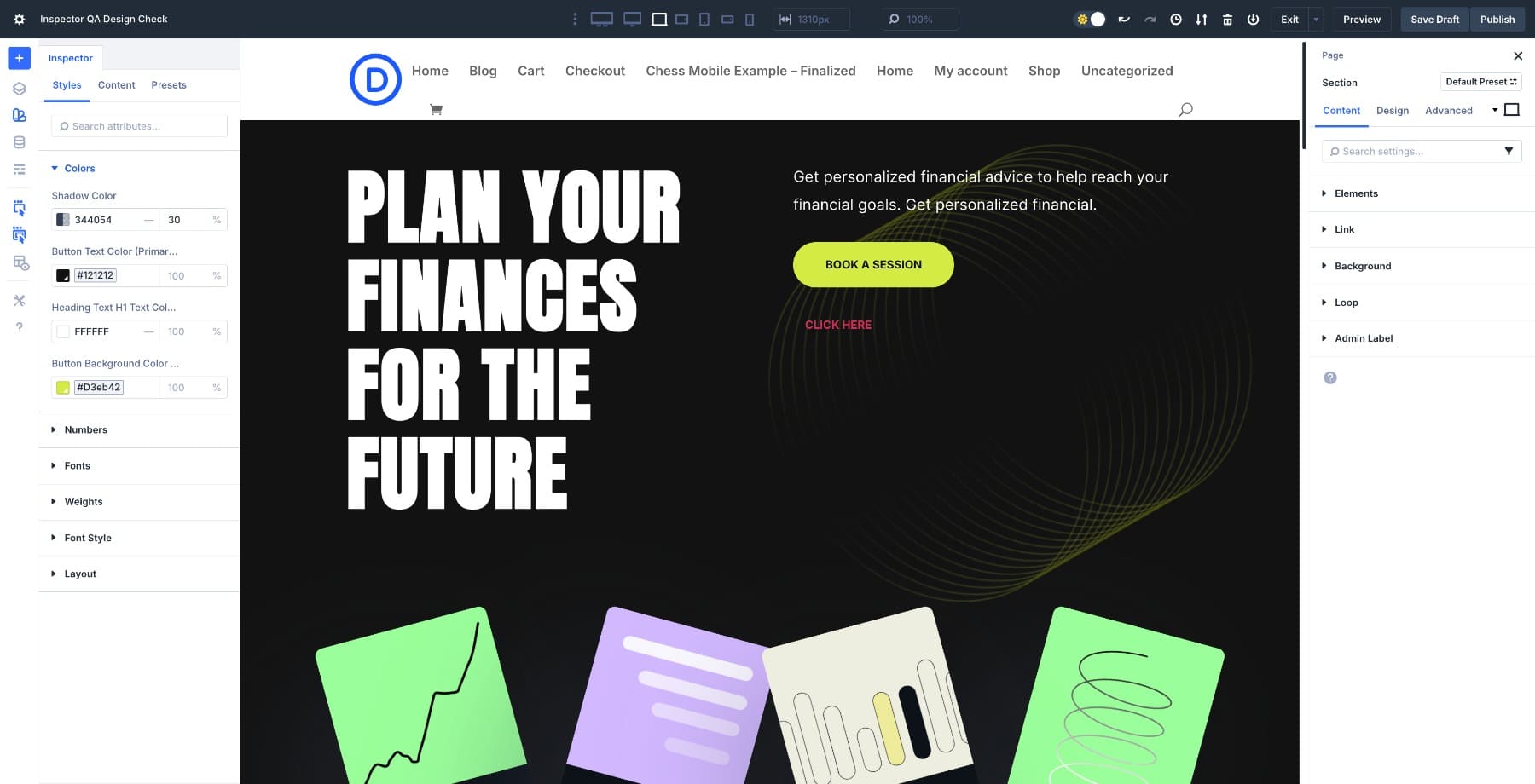
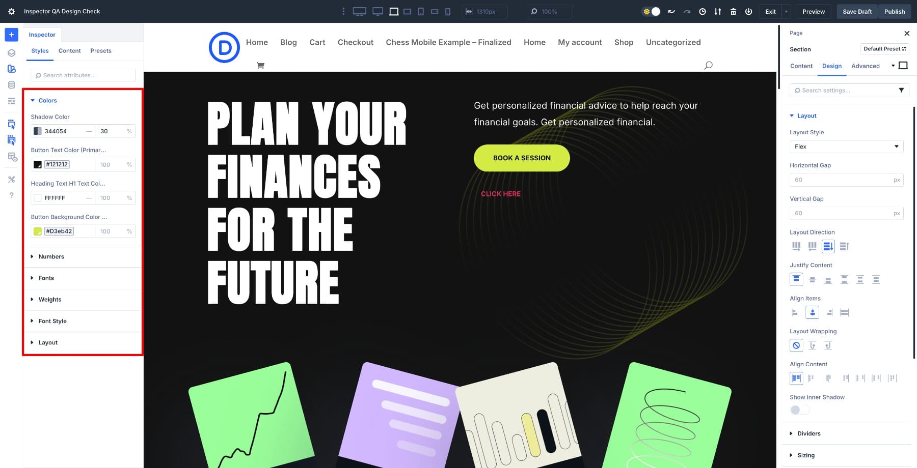
The Inspector in Divi 5 is a visual panel that lets you view everything happening in your design without opening multiple settings windows. When you select a section, row, or module, all applied design and content settings are immediately displayed in one sidebar.
You immediately get an idea of how exactly that part of the page is structured. Colors, fonts, spacing, and presets all appear at once, turning the usual guesswork of a design review into something more akin to following a clear map.
The Inspector only displays fields that have changed from Divi’s default settings, so you don’t have to wade through dozens of unchanged settings. On a brand new button or module, the panel will look blank until you change a value or apply a variable or preset.
But as soon as you change design fields or apply Expand Attributes from a styled button, the Inspector will populate with those custom fields. No more hunting through endless options trying to piece together what you edited hours ago.
You can also adjust the values directly in the panel and see the layout update in real time. Click on another section or module and the sidebar will automatically refresh to show only the relevant settings for that element.
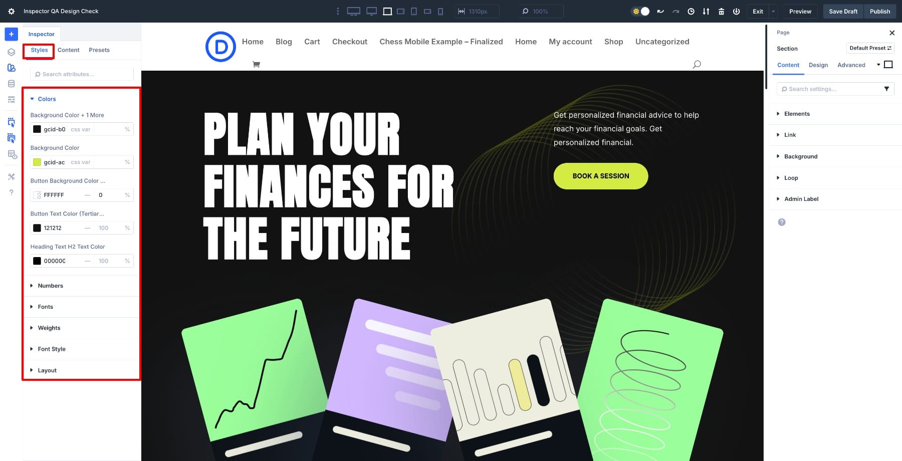
Within the Inspector (also called the Style Inspector in the documentation), everything is organized in three main tabs: Styles, ContentsAnd Presets. The Styles tab includes typography, spacing, and colors.
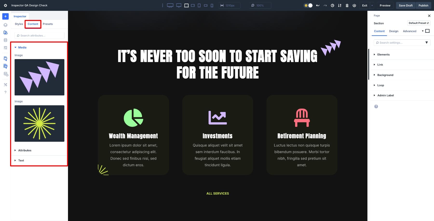
The Content tab displays text, images, and attributes.
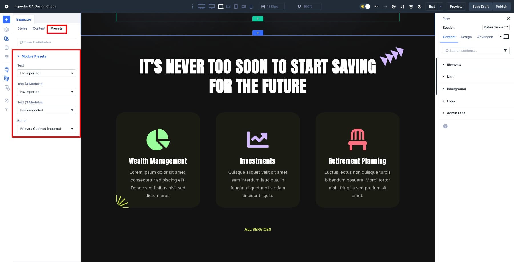
The Presets tab will indicate which global style has been applied so you can confirm that your modules are compliant your design system.
With every operation visible in one sidebar, you no longer have to jump between modules or try to remember which button used a custom color. You can move through the page methodically: look at a section, check what’s changed, make adjustments if necessary, and then move on.
The Inspector refreshes immediately when you select new elements, keeping the flow smooth as you scroll from the hero to the footer. Small inconsistencies in spacing or typography gradually become apparent. By the time you reach the end of the page, you’ve already reviewed every field you changed and confirmed that your landing page is polished, consistent, and ready to launch.
Learn all about Divi 5’s Inspector
How to perform pre-launch design QA
You’ve seen how the Inspector brings up every changed field in your design. Time to put it to work with a full-page review. Start with a brief overview before delving into the individual sections.
1. Scan the entire page first
Start with a high-level assessment before diving into the details. When you open the Inspector with nothing selected, it displays a page-level overview of all the styles, content, and presets currently used on the page, with an emphasis on fields that differ from Divi’s defaults.
As you scroll, look for anything that looks visually off, such as misaligned sections, uneven padding, or colors that don’t match your palette. But go further than just looking.
Look at the page to blur the details and see if your visual hierarchy still holds. The most important elements should still stand out, even if everything is slightly out of focus. If not, there are likely inconsistencies in spacing or dimensions that need attention.
Here’s what specifically you need to check.
- Typography: Open a few headings in different sections and compare their font family, weight, and size in the Inspector. If you use design variables, they must all point to the same variable names. Hardcoded values mixed with variables are usually a sign that something was copied and pasted or manually overwritten and never cleaned up.
- Buttons: Click through different buttons in different sections and check if they come from the same preset or design variables. Look specifically at their padding values. Buttons that look “almost the same” often have slightly different padding, which creates subtle visual noise.
- Distance: Use the Inspector to check the margin and padding values as you scroll. If you see a pattern like 40px, 45px, 40px, 50px between similar elements, you have found an inconsistency. Tighten these values to a consistent rhythm depending on your distance scale.
At this stage you haven’t solved anything yet. You build a mental list of patterns to verify which sections use hardcoded colors instead of variables, where your system’s spacing is off, and which elements might need preset adjustments. This initial analysis will indicate what you should focus on as you begin the detailed, section-by-section review.
2. Check out the hero section
The hero section sets the tone for the entire page and needs a thorough review. Keep the Inspector open on the left and the Element Settings panel on the right so you can see the visual output alongside the underlying design details.
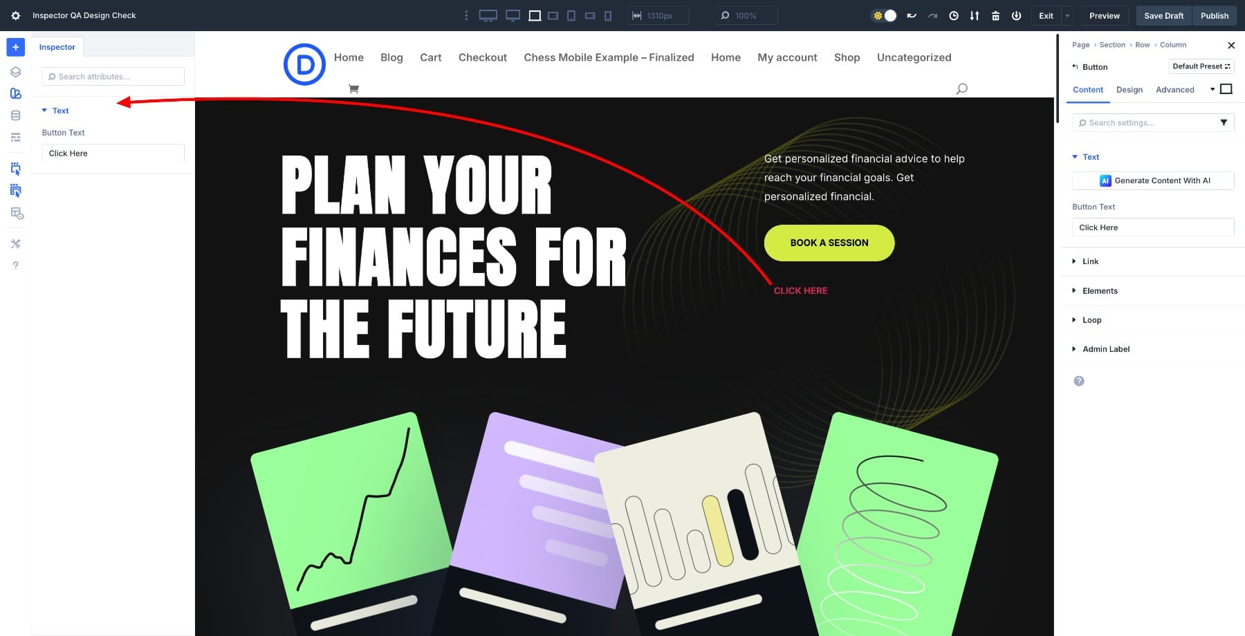
Click on the hero section’s wrapper and inspect it in the Inspector to confirm that headings, subheadings, buttons, and images all get their styles from your design variables for colors, fonts, and spacing.
When something uses a hardcoded value, hover over the field option and click the Dynamic content icon to apply the correct variable.
![]()
For newly added buttons, you won’t initially see any changed fields because they use default styles. Use Extend Attributes to inherit design settings from an existing button, and the Inspector will immediately populate these inherited values. You can verify that the new element matches your existing design patterns.
Once you’ve verified your design variables, review the layout structure. If you switched the hero section to Flex, check the alignment and spacing between the elements. You can adjust the column alignment from Section settings > Design > Layout > Content justification.
Switch to tablet and mobile views to check if the hero content is displayed correctly. Look for cropped text or overlapping elements that may appear on smaller screens.
Once everything in the hero is aligned with your preset styles and pulled consistently from your design system, you’re ready to move down the page.
3. Go section by section
The process is now faster because the Inspector displays every changed field for the active section without the need to manually open or expand.
Click through each section and scan for visual consistency. Make sure that the headings follow the same hierarchy, that the colors are derived from your design variables, and that the spacing between modules remains consistent. If something is wrong, hover your mouse over the field in the inspector to see what has changed. You can reset it or reapply global variables directly from the panel.
Complete your QA by reviewing the footer, as it often contains minor inconsistencies that go unnoticed. Verify that all links, icons, and text use the same color variables and hover states. Check that the typography matches the main style of your design system and that the spacing between columns or widgets feels balanced.Check that the logo and copyright text are properly aligned and readable on all screen sizes. If your footer contains buttons or forms, use the Inspector to confirm that they inherit the correct global presets.
Reduce your design QA time with Divi 5’s Inspector
Divi 5’s Inspector lets you see every change in one place, so you can spot inconsistencies and verify global presets without having to search through settings panels. What used to take an hour to click through modules now takes minutes of scrolling and scanning.
By the time you get to the bottom of the page, you know exactly how each section is structured and that it all follows the same design system. It’s a quick final step that turns a good landing page into a polished page ready to go live.
#perform #prelaunch #design #Divi #Inspector