")
Houses became larger, technology became a central factor in everyday life and ideas about comfort and success changed rapidly. ‘Beautiful’ homes were not minimalist or understated: they were expressive, layered and eager to show off what they had.
Many of the hallmarks that defined the decade were intended to signal modernity, progress, and a certain level of arrival. They addressed real needs at the time, even if they feel dated or excessive now.
Looking back, these elements represent a very specific idea of what a good home should be.
Here are 10 home features that defined the 1990s – and what happened to them afterwards.
#1 Sunken living rooms
What it then signaled: Architectural refinement and separation
Why it felt modern: A sunken living room suggested a deliberate design rather than a simple box. It created visual interest and subtly separated the ‘formal’ space from the rest of the house without adding walls.
Where it went: Accessibility issues and open floor plans made level changes less attractive. Nowadays, flat, continuous floors are preferred because of their flexibility and flow.
#2 Glass block walls
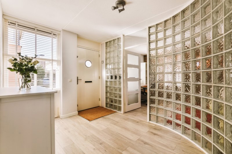
What it then signaled: Privacy without sacrificing light
Why it felt modern: Glass blocks simultaneously offered a futuristic, architectural look allow daylight to pass through. They were often used in bathrooms, stairwells or entrances as a stylish compromise between openness and privacy.
Where it went: As tastes shifted toward cleaner lines and simpler materials, glass blocks began to feel bulky and visually busy. Clear glazing and minimal framing replaced this.
#3 Cabinet doors with mirror
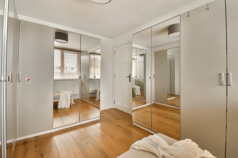
What it signaled then: Space, clarity and usability
Why it felt modern: Mirror doors made rooms feel larger and brighter, especially in bedrooms without generous square footage. They also doubled as full-length mirrors, which felt efficient and contemporary.
Where it went: Reflections multiplied the clutter and felt visually chaotic. Solid doors and integrated closet systems replaced mirrors as storage design improved.
#4 Built-in entertainment centers
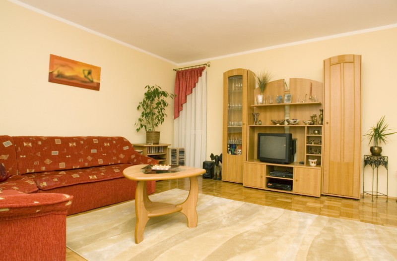
What it then signaled: Serious involvement in home media
Why it felt modern: With bulky TVs, VCRs, stereo systems and gaming consoles, entertainment centers were designed to accommodate it all. The built-in technology made technology feel permanent and important.
Where it went: Flat screens, streaming and wireless technology made these structures obsolete. Today’s media settings are lighter, more flexible or completely hidden.
#5 Formal dining rooms in everyday homes
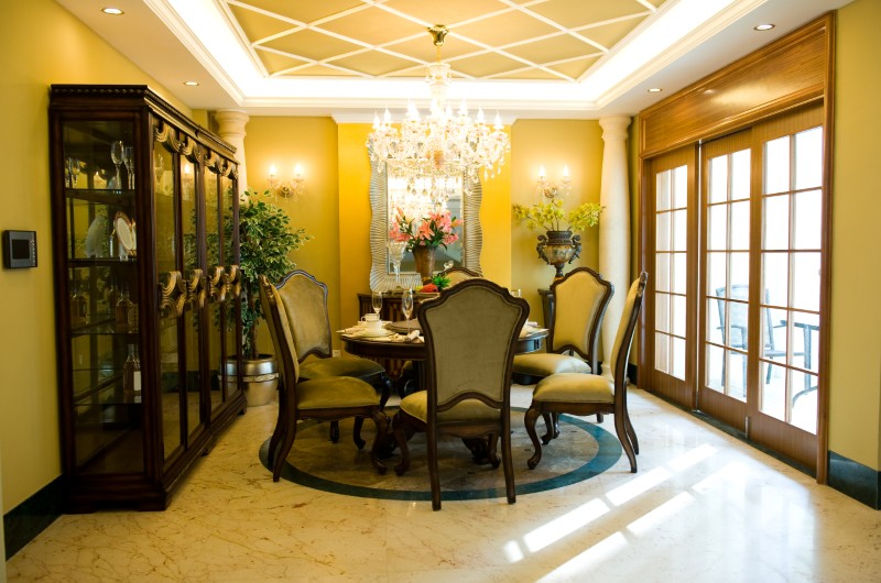
What it signaled then: Willingness to entertain
Why it felt modern: A dedicated dining room suggested a lifestyle that included hosting dinner parties and vacations with intention. Even if it was rarely used, it radiated brilliance and completeness.
Where it went: Casual dining and open kitchens took over this function. Many formal dining rooms were repurposed as offices, playrooms or flex spaces.
#6 Tuscan style kitchen
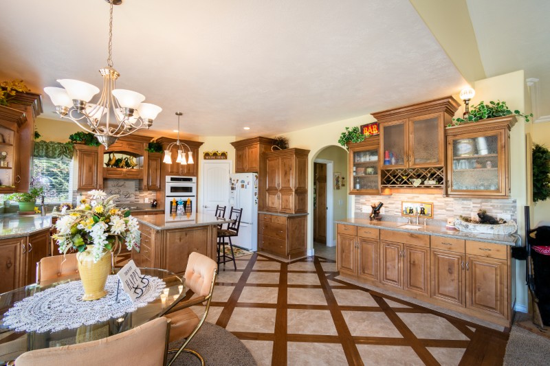
What it signaled then: Warmth, travel and ambitious taste
Why it felt modern: Dark wood cabinets, ornate tiles and faux-antique finishes evoked European villas and a sense of old-world luxury. It was a reaction to the grim kitchens of previous decades.
Where it went: The look ended up feeling heavy and overly thematic. Lighter palettes, simpler cabinetry and cleaner lines replaced the Tuscan aesthetic.
#7 Track lighting
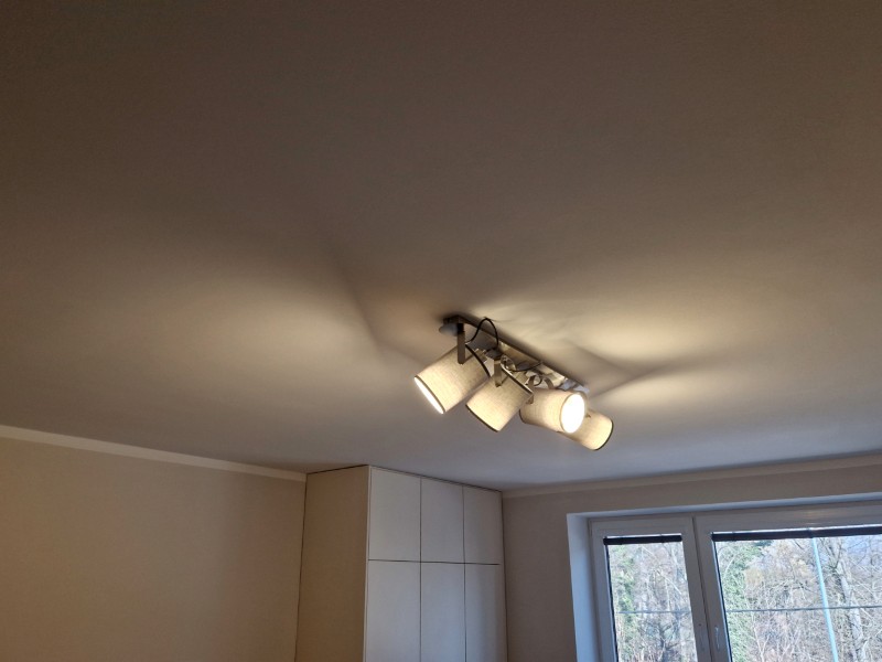
What it signaled then: Flexibility and modern lighting
Why it felt modern: Track lighting allowed homeowners to direct light exactly where it was needed. It felt technical, customizable and much more advanced than standard ceiling fixtures.
Where it went: Advances in recessed and integrated lighting made the rails feel visually cluttered. The lighting became quieter and more architectural.
#8 Background borders
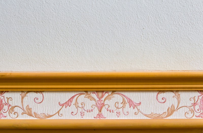
What it signaled then: Personal style and decorative confidence
Why it felt modern: Borders were an easy way to add character without needing a full background. They allowed pattern, color and theme into otherwise neutral rooms.
Where it went: Boundaries started to feel fussy and outdated. Paint, texture and full wall treatments took their place.
#9 Hot tubs
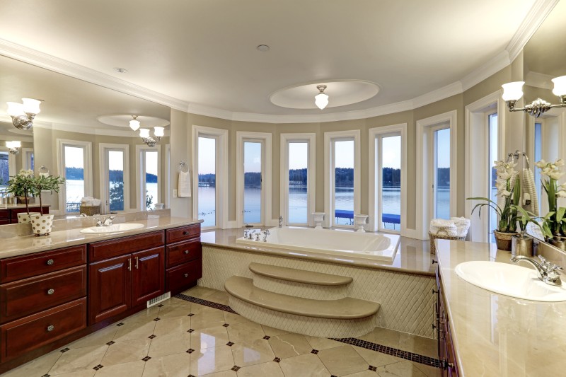
What it signaled then: Spa-like luxury at home
Why it felt modern: Hot tubs promised relaxation and pampering, bringing hotel-style amenities into the private bathrooms. They were a definite upgrade from standard bathtubs.
Where it went: Maintenance issues and changing preferences made them less attractive. Walk-in showers and simpler bathtubs became the priority.
#10 Two-story foyers

What it signaled then: Scale and status
Why it felt modern: A dramatic entrance made a strong first impression, with volume and architectural ambition. It immediately told visitors that this was a ‘big’ house.
Where it went: As priorities shifted to usable space and energy efficiency, two-story foyers began to become impractical. Homes now emphasize flow over spectacle.
More stories
What a “modern house” meant in every decade since the 1950s
25 home features that were considered luxurious just 15 years ago
Here are 13 of our favorite Midcentury Modern homes (and some of their famous former owners)
#Home #Features #Defined #Nineties